tiket.com / Train
Improving Train’s Booking Form Experience
This project will demonstrate my expertise in these three crucial domains:
Product Thinking
Product Design
Hi-fi Prototyping
In A Nutshell
Small Improvements, Large Impact
Due to multiple user Error Search Results, my team and I conducted the following to improve our design & user experience:
User Behaviour Analysis through Amplitude
Usability Testing on Train Users
Impact x Implementation Matrix
How Might We Framework
These efforts resulted in a:
+2.12 % increase in Train's Booking Rates.
90% users filling in Passenger Details.
Here’s how the story goes ▼
Context
tiket.com is a South-east Asia’s Travel unicorn, serving 52+ millions active users. Offering 10+ travel solutions like Flights, Hotels and Trains.
Research Findings
Churning Users
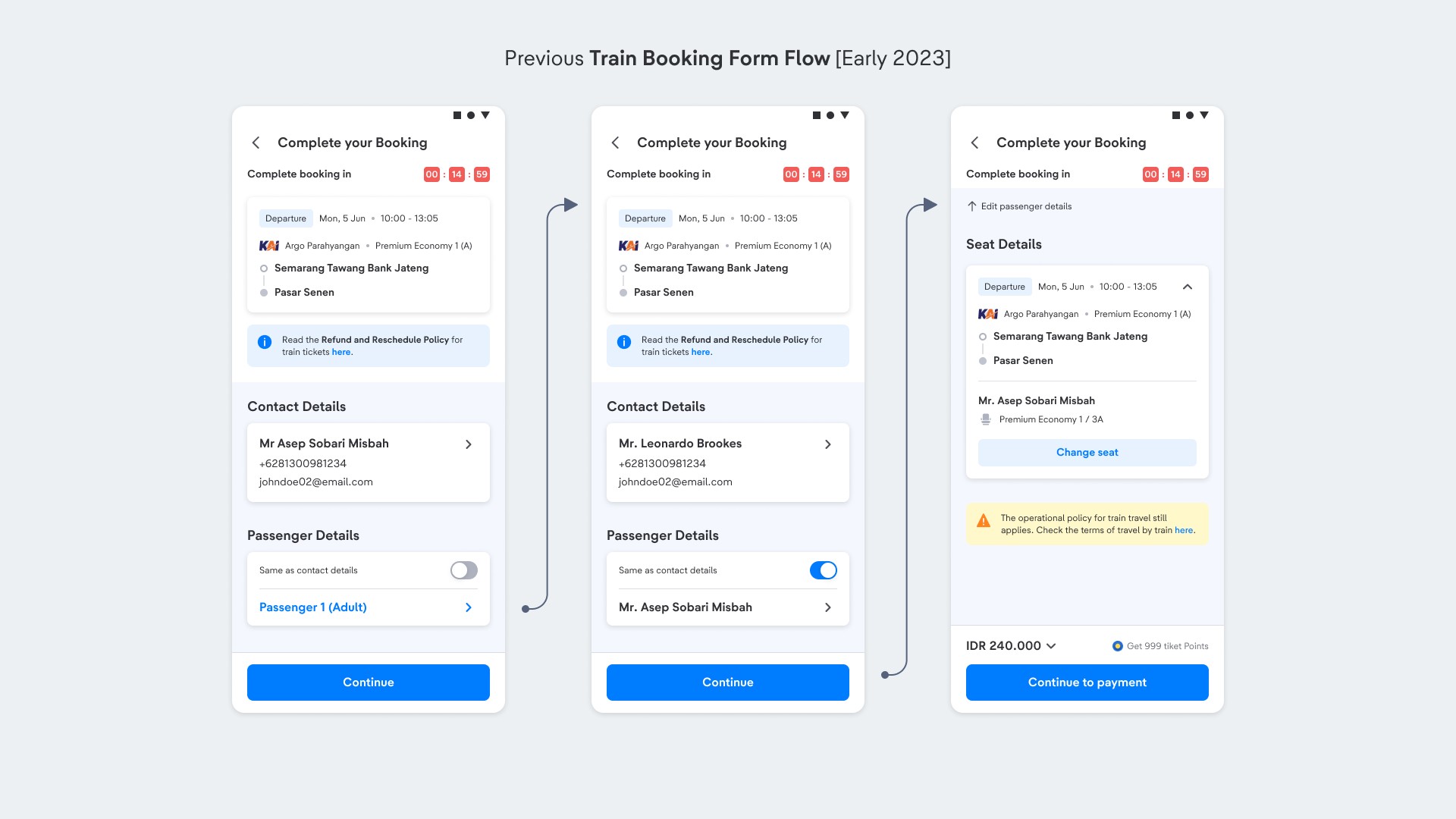
After releasing our new Train Booking Form designs in early 2023, we found that 62.5% of users dropped off after the first page.
To address this, our team first conducted the following methods to identify potential problems:
Deep User Behaviour Analysis through Amplitude
Live Usability Testing on Train Users
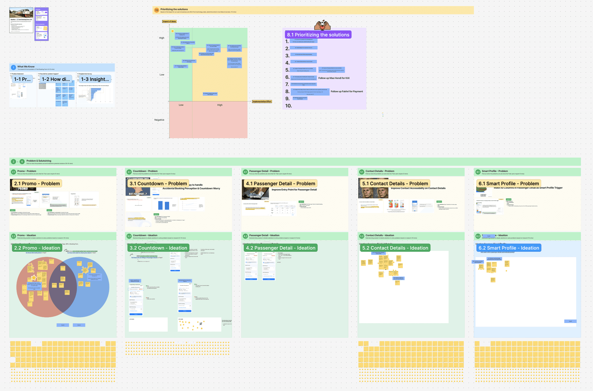
After identifying potential issues, I facilitated an ideation session with key stakeholders (Product Managers, Tech Leaders, Commercial, and Business Intelligence teams) to gather data and brainstorm potential solutions.
We then used an Impact x Implementation Matrix to prioritize high-impact problems, leading us to focus on the three issues below.
Problem #1
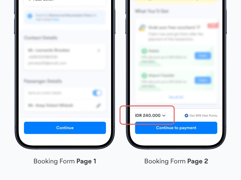
Difficulty in Viewing Final Price Breakdown Early
Train users compare prices across OTAs and seek a final price breakdown before payment, but our design only provides this on Booking Form Page 2, which users view as a barrier.
Problem #2
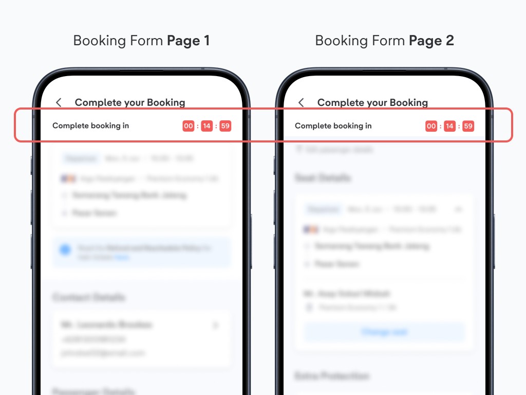
Difficulty Understanding Countdown Meaning
Train users often mistake the countdown in our Booking Form for payment duration rather than booking process duration, leading to concerns about accidental bookings and higher drop-off rates.
Problem #3
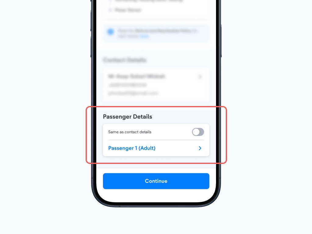
Difficulty noticing Passenger Details
Participants see the passenger detail form as a barrier to accessing the final price breakdown, so evaluating its accessibility is crucial to avoid user frustration and incomplete transactions.
Solutions
Small Improvement, Large Impacts
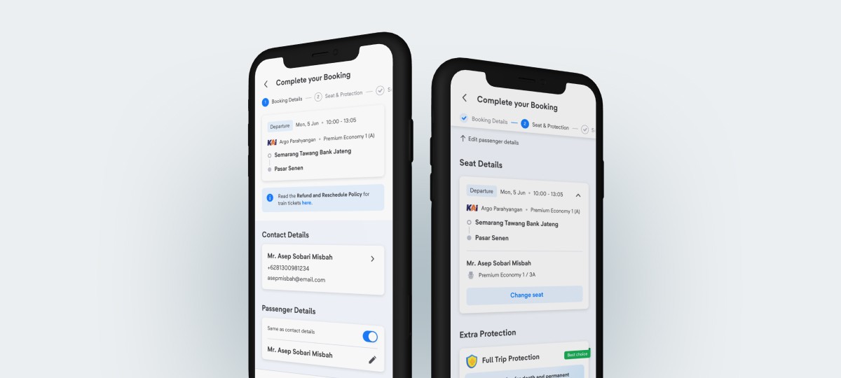
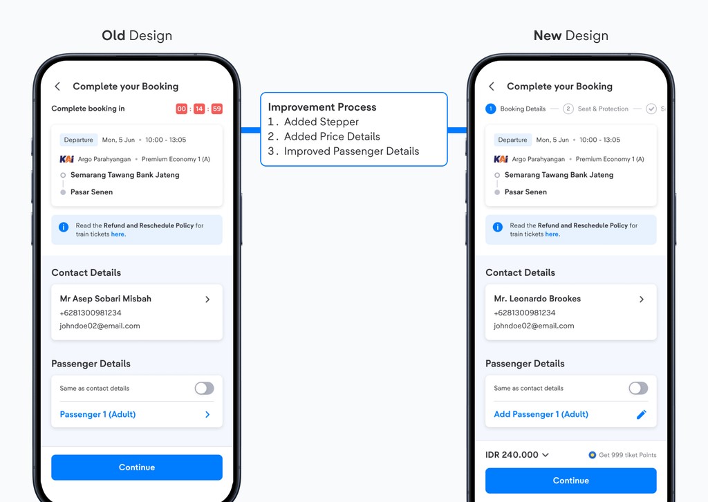
We improved 3 main aspects of our Train Booking Form.
1
Header: Guiding instead of Pressuring
We removed the booking countdown to prevent early drop-offs and added a stepper to visually guide users through the booking steps before payment.
2
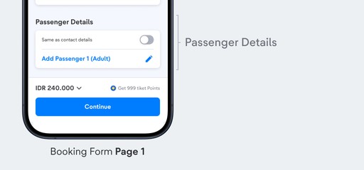
Passenger Details: Improved Copywriting & Icon
By testing different copywritings & icons during usability tests, the new wording uses "Fill" to invite users to enter passenger details, and the pencil icon indicates information to be filled or edited.
3
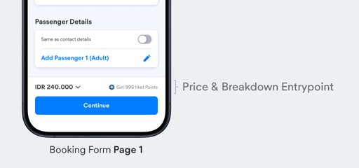
Price Details: Inform price breakdown early
We added a price breakdown entry point to provide users with full transparency on ticket prices and service fees before proceeding. This allows users to easily compare prices with other OTAs.
4
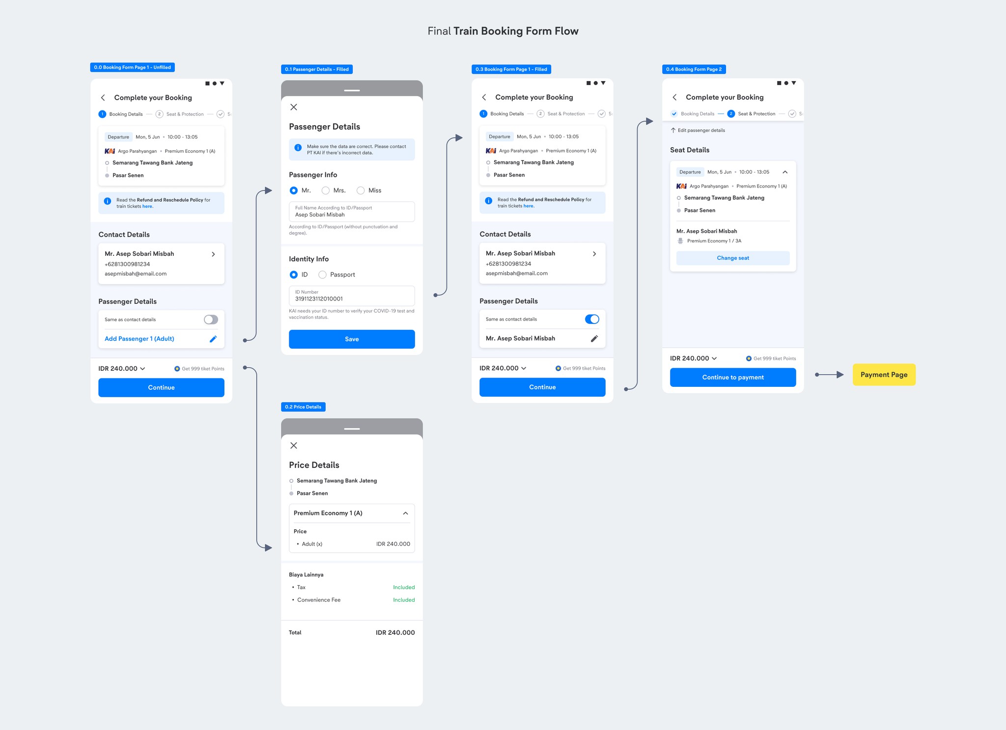
Final Booking Form Flow & Impact
To validate whether my designs worked, we conducted an A/B Experiment to test both designs. The new designs resulted in the following results:
+2.12%
Increased CVR (Conversion Rate) from Booking Form Page 1 to Purchase
90%
Filled in Passenger Details
Reflection
What I've Learnt & Special Thanks
During this project, I've got the opportunity to:
Learnt more about User Behaviour Analysis (Amplitude)
Leading Workshops & Using "Impact-to-Implementation" Matrix
Working with Business Intelligence Team
Conducted A/B Experiment and having the new designs win
However, although this project is deemed successful, the best solution would be to improve our location datas.
Shoutout to all collaborators
Huge shoutout to everyone I collaborated with during this project
Product Design team - Lia, Nindya, Yossie, Misbeh, Ryan S
Product team - Alwan, Agung, Yocky, Babas
Commercial Team - Julian, Hendi & Caca
Tech Leads - Adhy, Endy, Fakhri & Setiady
and many more others.

