tiket.com / Car Rentals
Improving Car Rental's Business Scheme & User Experience
This project will demonstrate my expertise in these three crucial domains:
Product Thinking
Product Design
Hi-fi Prototyping
In A Nutshell
Revamping Business Model & User Experience
In response to numerous complaints about our business model and user experience, my team and I took several steps to improve our design and user experience:
User Interview from Customer Service Complaints
User Behaviour Analysis through Amplitude
Usability Testing on Car Rental users
How Might We Framework
These efforts led to:
+16.7% Increased CVR from Landing Page to Search Result Page
+218% Increased CVR viewing Car information
+19.8% Increased CVR from Product Detail Page to Booking Form
+8.2% Increased CVR from Booking Form Page to Payment Page
-5% Decreased in inquiries regarding How to Rent
-8% Decreased in complaints regarding Area/Zone Usage
Here’s how the story goes ▼
Context
Understanding Car Rentals
tiket.com is a South-east Asia’s Travel unicorn, serving 52+ millions active users. Offering 10+ travel solutions like Flights, Hotels and Trains.
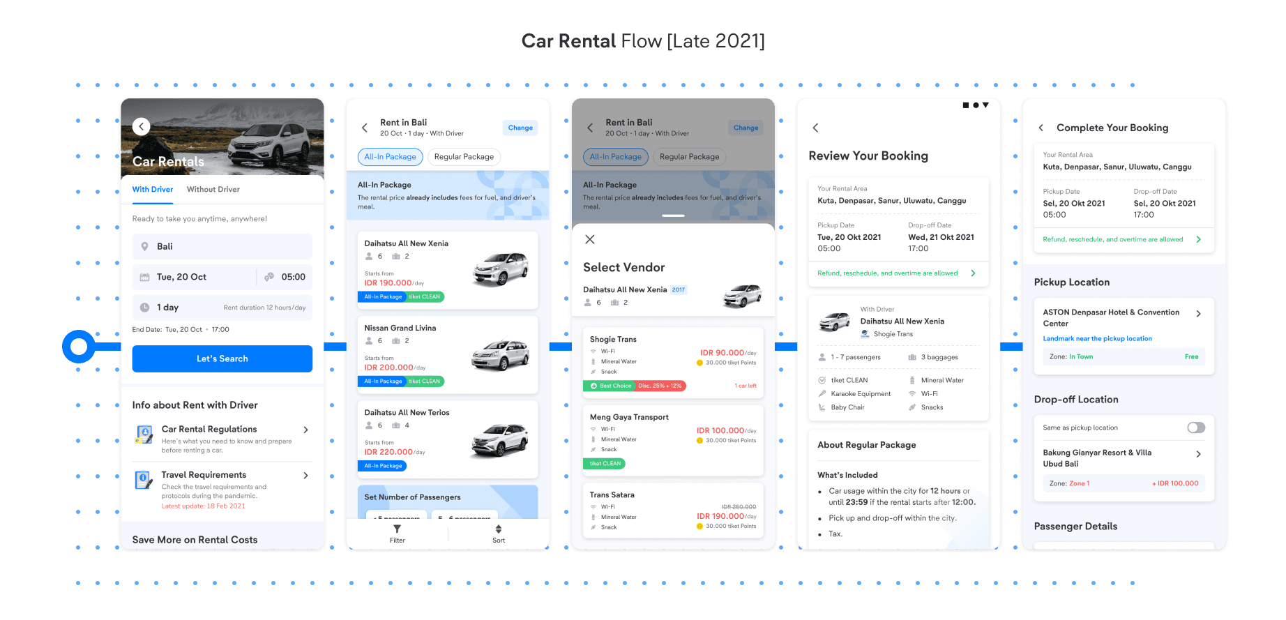
Car Rentals by tiket.com offers car rental services across Indonesia, with options to rent with or without a driver. The main product flow includes:
Landing Page: Users input the rental city, date, time, and duration.
Search & Vendor Selection: Users choose the car type, vendor, and package from tiket.com.
Product Detail Page: Users review the selected car, vendor, and package details.
Booking Form: Users enter their pickup and drop-off locations, along with any additional Area/Zones they plan to visit.
Problem Discovery
High Complaints & Inquiries
During October 2021 - February 2022 period, there are a large number of complaints and inquiries regarding Car Rentals.
1
🚨 No Incentive to Explore
44% - General Information of Car Rentals
20% - How to order Car Rental at tiket.com
2
🚨 Unclear Business & User Experience
12% - Additional Payment & Zone Issue
Problem #1
No Incentive to Explore
Rather than exploring the product, users were directly reaching out to Customer Service with inquiries such as:
How to Book Car Rentals in tiket.com?
What are the regulations for renting in tiket.com?
Insight #1
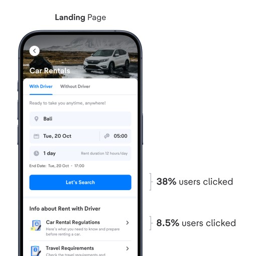
High Drop-off Rate in Landing Page
🚧 Lack of Guidance
We hypothesize that the lack of step-by-step guidance & visible entry points causes this confusion.
→
❓ How Might We
Educate users early on the car rental booking process and rental regulations on tiket.com
Solutions #1
Guiding Our Users
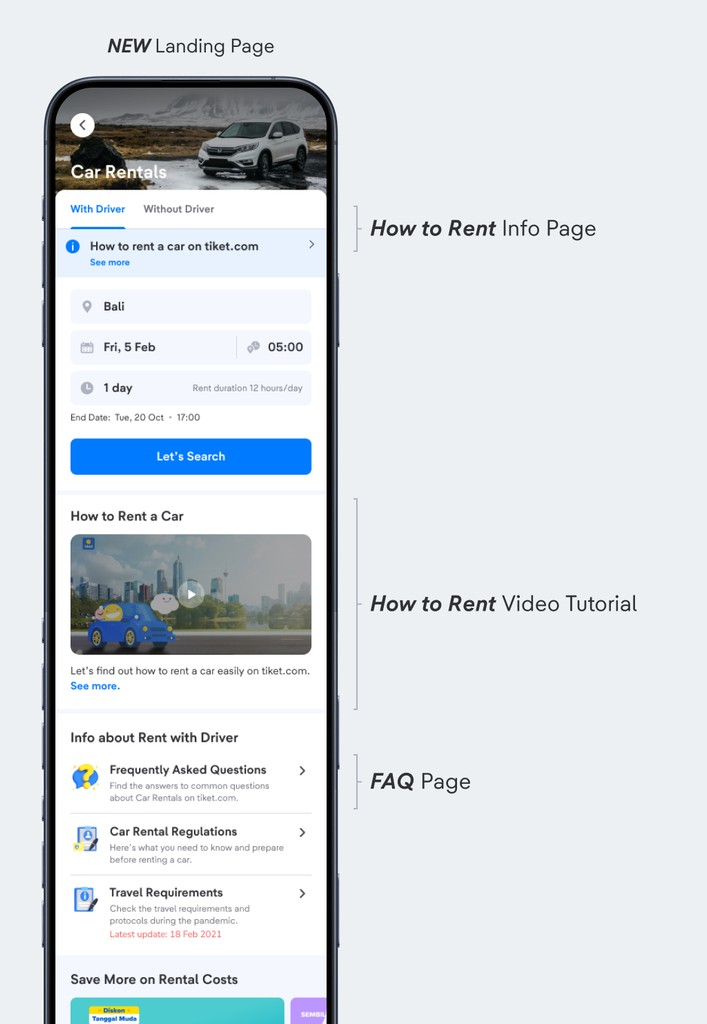
To educate our users early in the process, we improved our landing page by designing 3 new features:
1
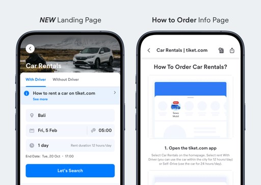
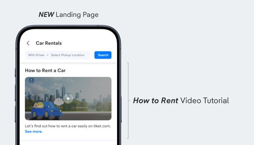
Info Page Banner - How to Rent Cars in tiket.com
Create a clear entry point for users to access a step-by-step car rental guide on tiket.com before booking.
2
Video - How to Rent Cars in tiket.com
A visual guide that walks users through the car rental process on tiket.com.
3
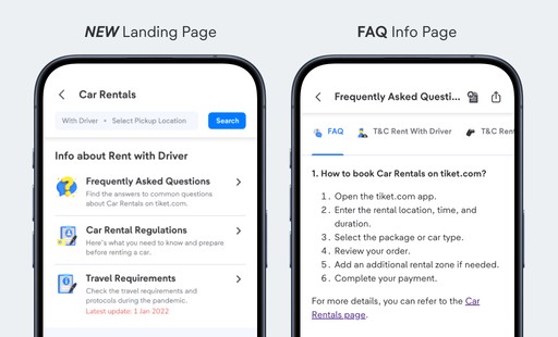
Frequently Asked Questions Page
A comprehensive FAQ section answering the most common inquiries about the Car Rental product.
4
NEW Landing Page & Impact
To validate whether my designs worked, we conducted an A/B Experiment to test both designs. The new designs resulted in the following results:
+16.7%
Increased CVR (Conversion Rate) from Landing Page to Search Result Page
+218%
Increased CVR (Conversion Rate) viewing Car information including 3 new features above.
-5%
Decreased in inquiries regarding How to Rent
Problem #2
Unclear Business Model & User Experience
Users were complaining about:
Additional charges imposed by vendors.
Confusion around the concept of "Zones."
The user experience when adding Zones for rental.
Undestanding Zones
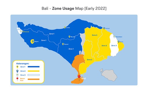
What is “Zone Usage”?
Problems with Zones
User Interviews (from Customer Service Complaints) and User Behaviour Analysis (using Amplitude) revealed that most customers who complained about the Zone feature were:
Unaware of the Zone Concepts,
Uninformed that purchasing a larger Zone includes all preceding Zones, and
Perceived the cost of adding Zones as excessively high after selection in the app.
In which, we can conclude 2 main problems:
1
🚨 Unclear Education of Zone Concept
2
🚨 Missing Important Information + Usability Problems
Zone Problem #2.1
Unclear Education of Zone Concept
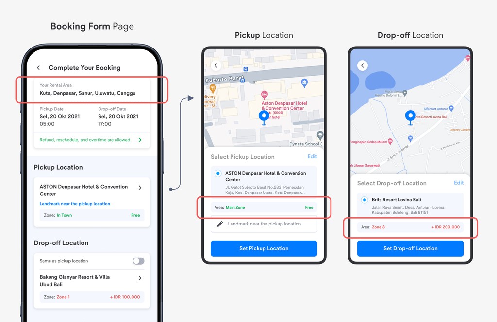
We evaluated our designs by identifying the sections across different pages that provide information on Zone and Zone Usage.
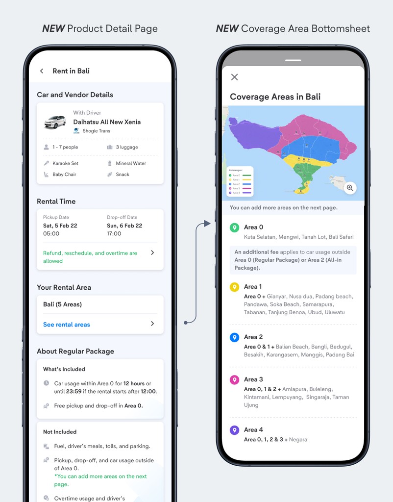
Product Detail Page
Informs Your Rental Area (covering the city's Main Zone / Zone 0) but lacks details of other zones.
No information which areas are considered within the city (Main Zone) or outside the city (Zone 1, 2 & 3).
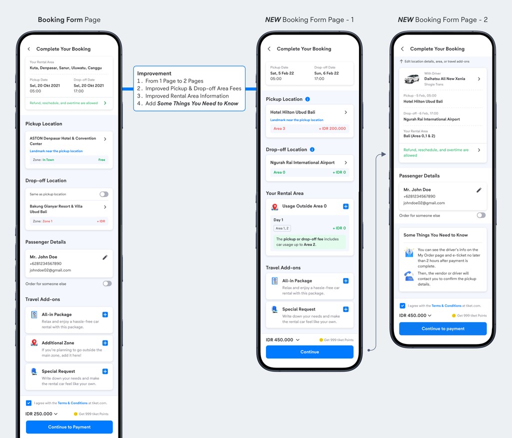
Booking Form Page
Informs Your Rental Area (covering the city's Main Zone / Zone 0) but lacks details of other zones.
Users will only know what Zone their designated location is at when filling in their Pickup & Drop-off location.
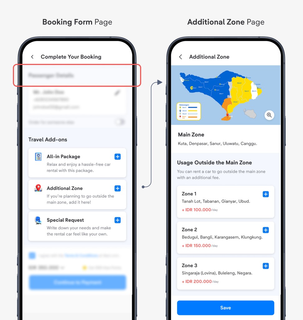
Additional Zone Page
Contains information about Zone concepts
Since it is optional and not prominently highlighted, users often overlook it and remain uninformed.
How Might We 💡
Seamlessly inform users regarding the concepts of Zone Usage during their booking process
Zone Problem #2.2
Missing Important Information + Usability Problem
Our designs do not present clear information regarding Zone Concepts, resulting users in surprise when charged by our Car Rental vendors.
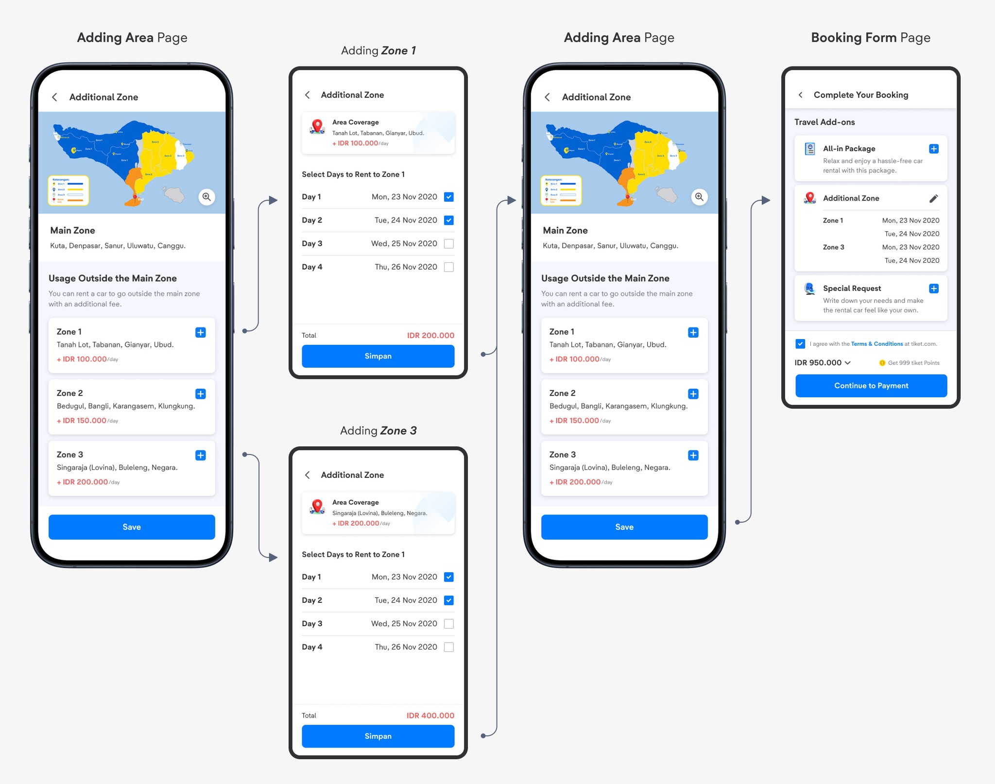
Adding Zones Page (Booking Form Page)
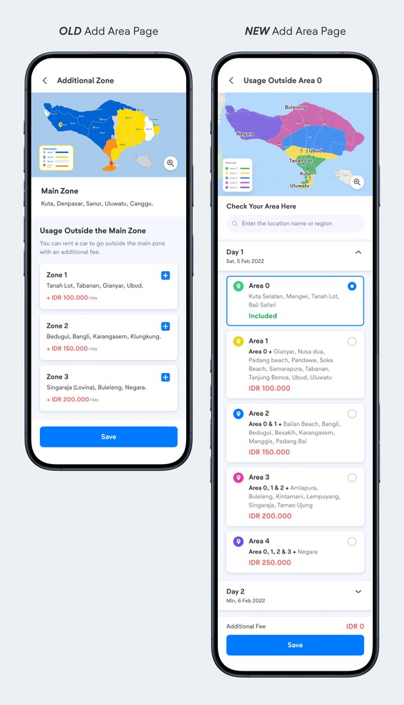
Our current design requires users to select Zones first and then choose the days for travel, leading to confusion when they are incorrectly forced to pay for Zones 1 & 2 after selecting Zone 3.
This creates a significant usability issue, giving the impression of overcharging.
Additionally, after users add Zones, the booking form does not clearly display the cost for each selected Zone.
How Might We 💡
Communicate that a larger Zone includes all preceding Zones to minimize confusion and extra charges
Solutions #2
Revamping our Business Model & User Experience
Through multiple iterations and usability tests, we refined three key pages: the Product Detail Page, Booking Form Page, and Adding Zones Page.
Before breaking down each page, we also found through qualitative research that users found the term "Zone" unclear, prompting us to replace it with "Area" for improved clarity.
Product Detail Page
1
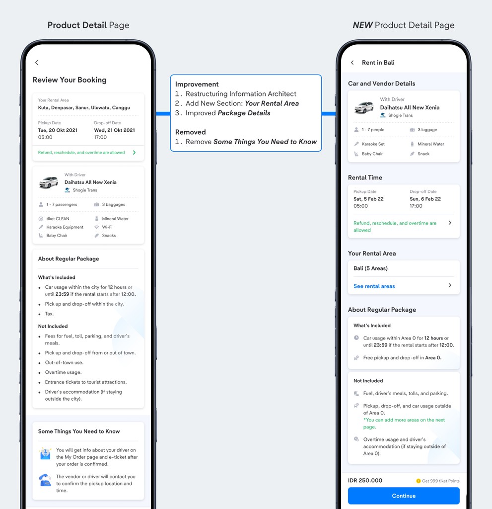
Restructuring Information Architect
We restructured our Product Detail Page by aligning it with our users' primary intentions when exploring the page, prioritizing the following order:
Car & Vendor Details
Rental Details
What’s Included & What’s Not
2
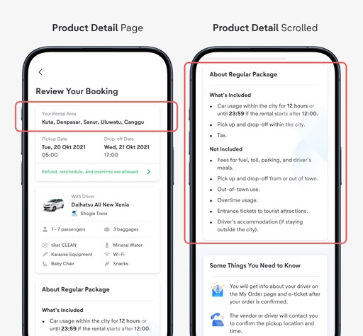
New Section: Your Rental Area
Provide users with early education on their city’s Rental Area(s).
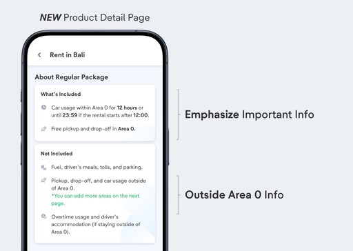
3
Improved Package Details
Simplified the section and emphasized key information, particularly regarding the Rental Area.
4
NEW Product Detail Page
To validate whether my designs worked, we conducted an A/B Experiment to test both designs. The new designs resulted in the following results:
49.3%
CTR (Click-through Rate) of Your Rental Area
+19.8%
Increased CVR (Conversion Rate) from Product Detail Page to Booking Form
Booking Form Page
1
From 1 Page to 2 Pages
We restructured our Booking Form into two distinct pages:
First Page: Users input location and area details.
Second Page: A summary of the entered information, along with Things You Need to Know.
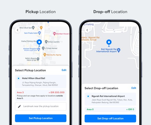
2
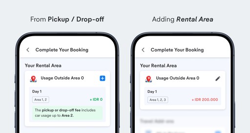
Pickup & Drop-off Area Fees
When users select their Pickup & Drop-off locations, we inform them of the associated Area fees and provide an explanation for the charges.
3
Adding a Rental Area
Informs users of the Areas added, whether through Pickup/Drop-off selection or adding them manually.
Add Area Page
1
Selecting Area by Date
We improved the flow by displaying dates with an expandable view, allowing users to select the furthest Area/Zone they'd like to travel to on a given day. This prevents any unnecessary overcharges when adding an Area/Zone.
2
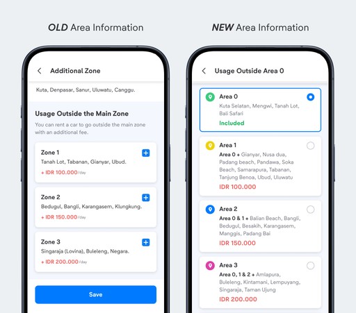
Informative Area Information
We emphasized that purchasing a further Area/Zone automatically includes all preceding Zones (e.g., purchasing Zone 3 for the same day also covers Zones 1 and 2, with no additional charges required).
3
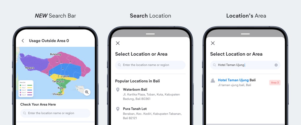
What is My Route's Area?
Users can now search to identify the Area/Zone associated with their designated route or location.
NEW Business Scheme & User Experience Impact
To validate whether my designs worked, we conducted an A/B Experiment to test both designs. The new designs resulted in the following results:
+8.2%
Increased CTR from Booking Form Page to Payment Page
+20%
Increased CTR of Add Area Page
-8%
Decreased in complaints regarding Area/Zone Usage
Reflection
What I've Learnt & Special Thanks
During this project, I've got the opportunity to:
Learnt more about User Behaviour Analysis (Amplitude)
Conducted Live Usability Tests with Research Team
Conducted A/B Experiment and having the new designs win
Shoutout to all collaborators
Huge shoutout to everyone I collaborated with during this project
Product Design team - Emilia, Datuk, Nindya, Misbeh, Ryan S
Product team - Alwan, Yocky, Babas
Tech team
and many more others.


